
What makes an MVP design investment-ready in 2025?
An investment-ready MVP design clearly demonstrates both current value and future potential by focusing on exceptional execution of fewer features rather than numerous poorly-implemented ones. It combines intuitive user flows, consistent visual language, clear data visualisation, and strategic design decisions that showcase your understanding of user needs and business fundamentals.
Key metrics investors evaluate:
Conversion rates (40% of users never return after first session)
Activation rates
Time to first "aha moment"
Retention rates (daily/weekly active users)
Engagement depth (time spent in product)
Time-on-task (workflow efficiency)
Why does design matter so much when seeking investment?
Let's start with a stark reality - roughly 40% of users who sign up for a new product never return after their first session (source).
Design directly impacts how investors perceive your product's maturity and your team's ability to execute. Poor design creates friction that damages metrics investors care about, while strong design tells two essential stories simultaneously: what your product can do today and what it could become tomorrow.
The days of truly "minimum" viable products are over. Today's investors expect to see evidence of user adoption before writing cheques, making intuitive design that showcases your product's value essential.
Key Takeaway: Your brilliant technology means nothing if investors can't get past your interface. They'll label a product as "too early-stage" in seconds, even when the underlying technology is revolutionary.
What design issues most concern investors?
It's obviously important to know what makes a great user experience (we've written about dark patterns and anti-patterns to avoid in UX design), but I've noticed investors consistently zero in on the same design problems. It's not about pixel perfection - it's about signs that you understand how to build products that scale.
Investors consistently focus on these design problems when evaluating startups:
Navigation and Flow: Complex or inconsistent navigation signals you haven't thought through how people will actually use your product
Visual Consistency: Mismatched elements raise concerns about your ability to build scalable products
Data Visualisation: Cluttered or confusing data presentation makes investors question whether users will understand your product's value
Mobile Experience: Broken layouts on mobile devices are an immediate red flag in 2025
Common investor reactions to poor design:
"This looks too early-stage"
Ghosting after seeing product visuals
Difficulty getting follow-up meetings
Questions focusing on UX rather than technology
What quick design wins make the biggest difference to investors?
Focus on these high-impact improvements to transform how investors perceive your MVP:
Colour and Consistency
Select 2-3 primary colours and apply them consistently
Implement the 8pt Grid system for spacing
Standardise typography, button styles, and UI elements
Simplify Your User Flows
Reduce clicks required for core actions
Make the next step obvious at every point
Optimise for the Peak-End Rule (users remember high points and endpoints)
Data Clarity
Use clear labels and thoughtful colour coding
Highlight key metrics that demonstrate value
Design visualisations for immediate comprehension
Contextual Design
Optimise for where and how users will actually engage with your product
Prioritise desktop or mobile based on user context
Show investors you understand your users' environment
Real-World Example: When Great Tech Meets Poor Design
Before: An Unpolished Product
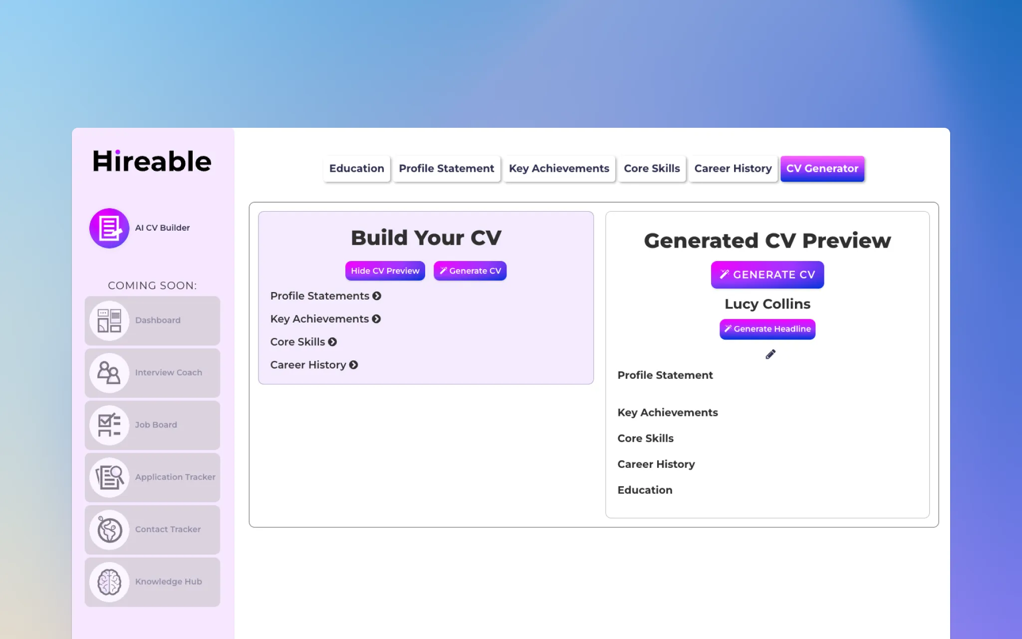
Let me tell you about Hireable, because their journey perfectly illustrates how design can propel you forward. They came to us with a CV builder that could parse job requirements and suggest tailored content for each section of your resume. They were doing something that wasn't yet done in the UK market.
The problem? Their functioning MVP had mismatched UI elements, complex navigation, and cluttered data displays. They wanted to pitch for investment but felt like their UI wasn't showcasing their true worth.
After: Investor Ready in Two Weeks
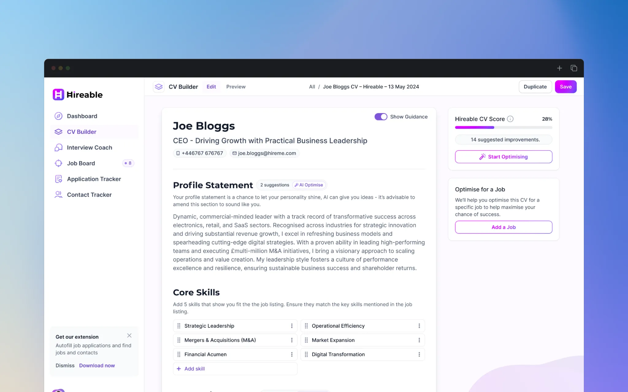
This transformation took two weeks but dramatically changed how investors viewed the product. But here's what really mattered: In their next investor pitch, they didn't have to explain their technology. The interface showcased it naturally, and investors could immediately see both the current value and future potential.
A clean and simplified interface with:
Consistent design language
Clear user journeys
Professional data visualisation
These changes helped secure £120k worth of investment within 90 days. That's the power of design.
What are investors really looking for beyond aesthetics?
Understanding how investors perceive your product goes deeper than aesthetics. A polished design doesn't just make your product easier to use - it tells a story about your understanding of business fundamentals and future vision.
Your product needs to show that you:
Understand your market deeply Are you solving problems in ways that show you've really listened to users?
Think about scale Can your design patterns handle 10x more features and users?
Have a clear path to revenue Show investors how you plan to monetise your product in a way that feels natural, not forced. Include thoughtful upgrade paths that demonstrate clear additional value. The best MVPs make the jump from free to paid feel like an obvious choice because users can see exactly what they'll gain.
Capture feedback Show how you're capturing user data and valuable feedback throughout the experience. This shows you're continuously learning and can adapt quickly based on what users are saying and potential market changes.
Reduce friction everywhere Simplify your core user flows to minimise steps and cognitive load. Every click should feel necessary and intuitive. Thoughtful integrations with tools users already rely on, well designed onboarding, and smart defaults all show you understand that time-to-value is critical for activation rates.
Show future potential Don't just show what your product is today, but hint at what it could become. Thoughtfully placed "coming soon" features, greyed-out advanced options, or roadmap previews can show your vision without promising features you haven't built yet.
Every design decision should demonstrate strategic thinking - from your information hierarchy to your mobile responsiveness. When investors see these elements working together, they don't just see a product; they see a business with room to grow.
We explore some of these psychological principles in more depth in our article about the Power of Self-Reference Effect.
Key Takeaway: Every design decision should demonstrate strategic thinking. When investors see these elements working together, they don't just see a product; they see a business with room to grow.
When should you seek professional design help?
Look, I get it. Professional design isn't cheap, and the decision to invest is tough. Here's when you absolutely need it:
You hear feedback about looking "too early-stage"
Your UI/UX Design doesn't match your technical capabilities
You struggle to get investor meetings
You get ghosted after sharing visuals
Your team lacks design expertise
Investment-Ready Design Checklist
Before you start your MVP design transformation, here's what you need to nail down. Think of these as your foundations - get these right, and everything else becomes easier:
Clear information hierarchy - Users should know exactly where to look first
Intuitive navigation - If users have to think about how to get somewhere, you've lost them
Polished first-time experience - You never get a second chance at onboarding
Consistent visual language - Use the same design patterns everywhere
Platform-optimised design - Your product should work perfectly wherever your users are
Professional data visualisation - Make complex information instantly understandable
Scalable design system - Build once, use everywhere
Final Takeaway: Good design isn't about making things pretty—it's about showing you understand how to build products that scale. Focus on consistent experiences and clear user journeys to show investors not just what your product can do today, but what it could become tomorrow.
FAQ: Design for Investment-Ready MVPs
How much should I invest in design before seeking funding?
Invest enough to demonstrate professional execution of your core features. Rather than building many mediocre features, focus on flawlessly executing fewer ones that showcase your product's unique value.
Should I prioritise mobile or desktop design?
Prioritise the platform where your target users will primarily engage with your product. If your users are mainly on mobile during commute hours, that should drive your design decisions. If they're comparing complex data sets, desktop might be your priority.
How can I improve conversion rates through design?
Focus on reducing friction in your core user flows by minimising steps, implementing smart defaults, and creating intuitive onboarding. Every additional click in your workflow can significantly impact conversion rates.
What's the most cost-effective way to improve my MVP's design?
Start with consistency—implement a simple design system with standardised colours, typography, and UI components. This creates a professional impression without requiring extensive resources.