
What Are Dark UX Patterns?
Dark patterns are design elements intentionally crafted to trick and manipulate people into taking actions they didn't intend to. You'll encounter them almost daily, as they use psychology to bypass principles like reactance (the feeling you get when your autonomy feels threatened).
In this comprehensive guide, we'll examine current dark patterns, provide real-world examples from major companies, and offer ethical alternatives that build customer trust and loyalty.
Why Do Some Companies Still Use Dark Patterns?
Simply put, they work in the short term. Many businesses focus on immediate metrics rather than long-term customer relationships. However, dark patterns can lead to:
Substantial regulatory fines
Negative reviews and brand reputation damage
Customer mistrust and eventual churn
Legal consequences (as seen in multiple class-action lawsuits)
Examples of Dark Patterns in UX
Misdirection | Sleaze rating: 3/5
Using visual hierarchy, styling, and design elements to lead users away from their intended choices or towards choices that benefit the business.
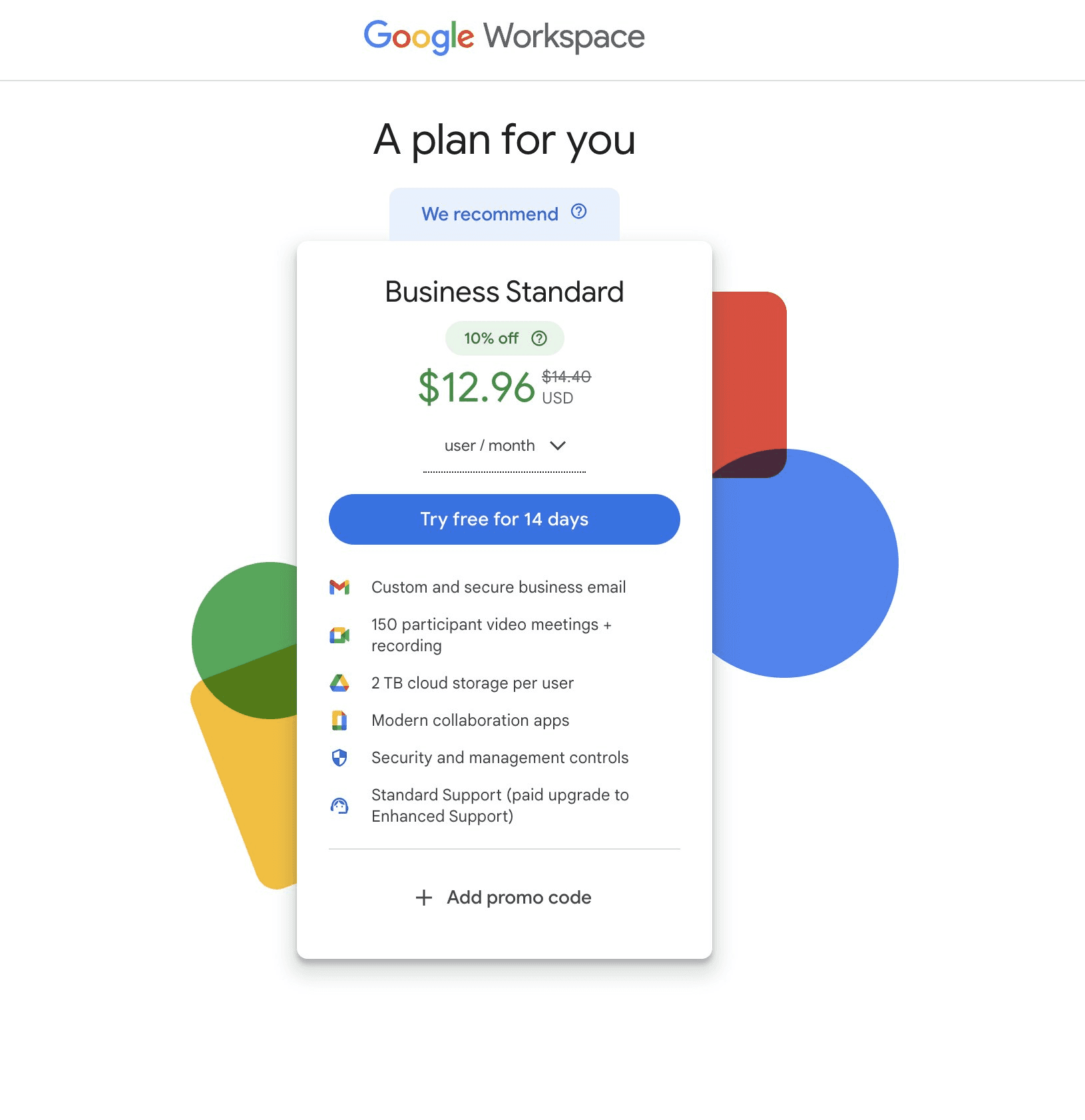
Users cannot select cheaper pricing plans when signing up
Must first sign up for expensive free trial then search for downgrade option
Deliberately obscures more affordable options
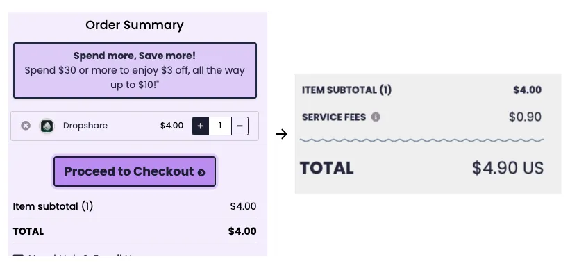
Hidden Costs | Sleaze rating: 4/5
Concealing or obfuscating additional charges until users are emotionally invested in the purchase process.
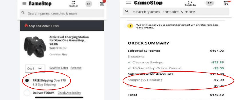
Example: "GameStop sued for adding hidden charges during checkout"
Users selected "FREE Shipping" but were charged anyway
Class action lawsuit seeking $5M in damages
Hidden charges revealed only at final stages
Bait-and-Switch | Sleaze rating: 5/5
Advertising one thing but delivering another, often after significant user investment.
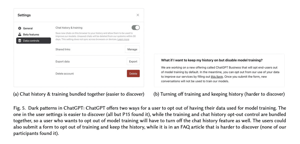
Example: "ChatGPT forces users to compromise on privacy by linking it to reduced functionality"
Free tier shows responses but requires Plus subscription to continue
Privacy opt-outs unnecessarily linked to reduced functionality
More flexible control hidden and difficult to find
Roach Motel | Sleaze rating: 5/5
Making it extremely easy to get into something but deliberately difficult to get out.
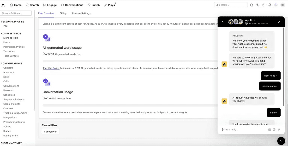
Example: "Apollo makes its hard to cancel it's subscription by redirecting it to an unresponsive chatbot"
Cancel button triggers unresponsive bot chat
No direct way to cancel subscription
Support deliberately unresponsive
Forced Continuity | Sleaze rating: 5/5
Making service cancellation deliberately complex while auto-renewal is seamless.
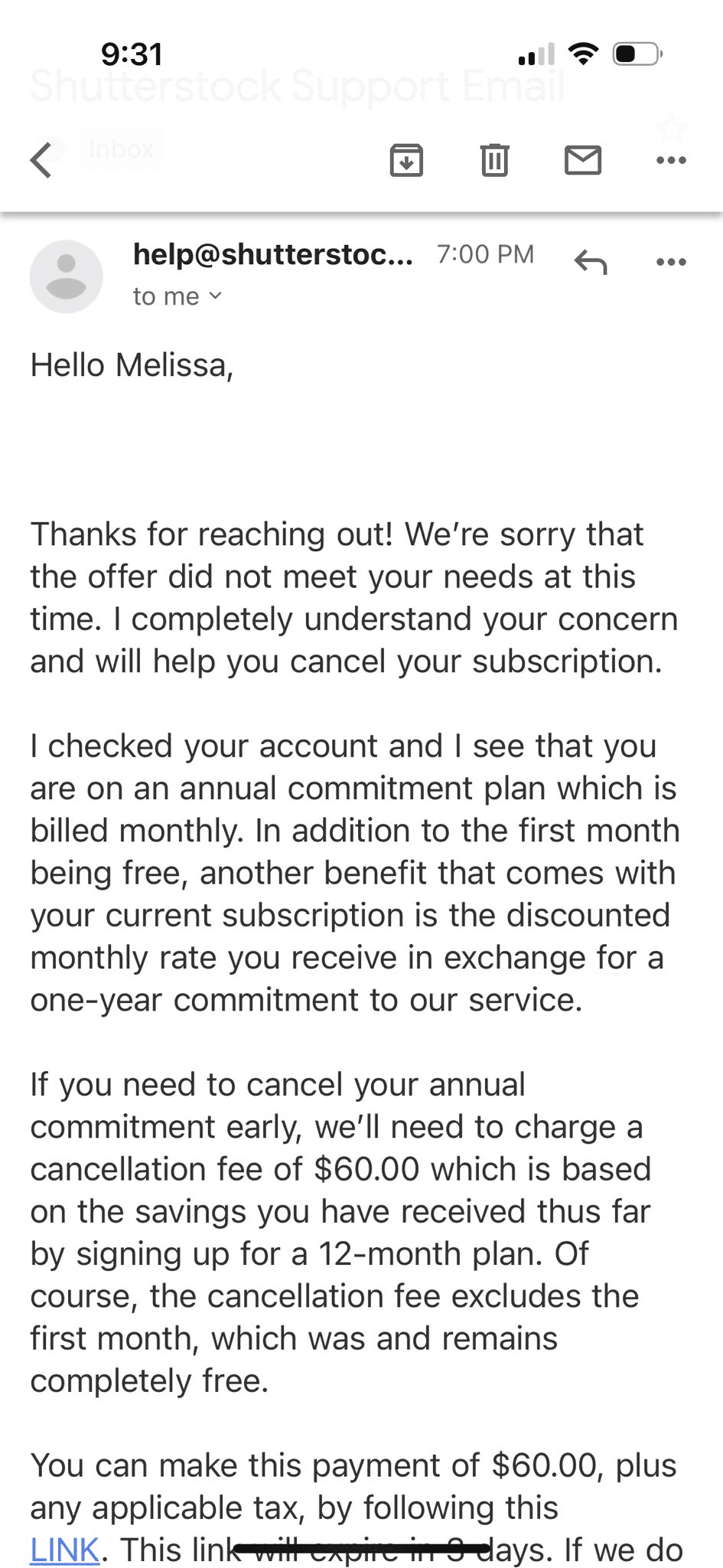
Example: "Shutterstock deploys recurring annual plans or termination with massive penalty"
Users unknowingly signed up for annual subscription through dark patterns in checkout
Charged $60 penalty to cancel even if service unused for months
No clear indication during signup of annual commitment
Renewal terms buried in fine print
Privacy Zuckering | Sleaze rating: 5/5
Making privacy settings intentionally complex or unclear.
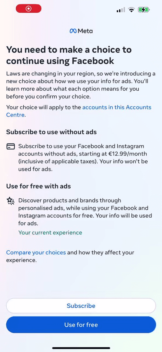
Example: "Meta pushes user to 'consent' to unrestricted use of their data"
New consent wall undermines EU Court ruling
Pushes unrestricted data use through confusing interface
Complex opt-out process
Disguised Ads | Sleaze rating: 4/5
Making advertisements indistinguishable from regular content.

Example: "X rolls out new ad format that can't be reported, blocked"
Ads not connected to actual X accounts
No disclosure that they are advertisements
Cannot be blocked or reported
Sneak into Basket | Sleaze rating: 4/5
Adding items or services to shopping carts without explicit user consent.
Example: "Bundle Hunt adding hidden costs during checkout"
Additional items automatically added to cart
No clear notification of additions
Difficult to remove items
Friend Spam | Sleaze rating: 3/5
Leveraging users' social connections without clear consent.
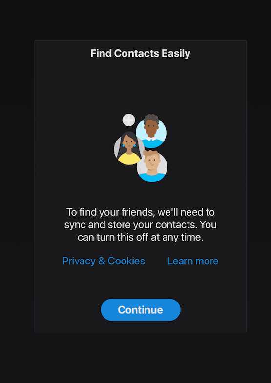
Forces contact sharing prompt when opening app
No visible way to decline sharing contacts
Obscures the ability to say "no"
Makes it appear mandatory for app functionality
Confirm-shaming | Sleaze rating: 3/5
Using guilt or social pressure to manipulate user choices.
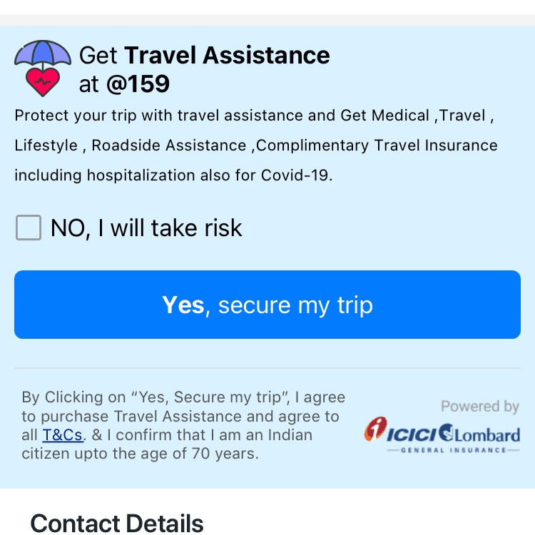
Example: "IndiGo manipulating emotions of users when booking flights to opt for travel insurance"
Uses emotionally manipulative language
Shames users who don't select insurance
Creates artificial fear of risk
Hidden Opt-Out | Sleaze rating: 4/5
Obscuring or complicating ways to decline optional features or sharing.
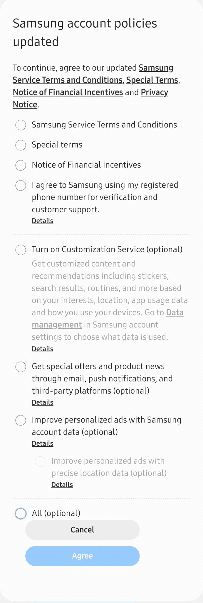
Example: "Samsung tricks users to accept all its new terms and conditions including optional ones"
Hides opt-out options in complex menus
Combines mandatory and optional terms
Unclear consequences of choices
Pre-checked Opt-Ins | Sleaze rating: 2/5
Defaulting to opted-in states for optional features or communications.
Example: "Air Canada forces its customers to receive promotional emails"
No way to opt out of marketing emails
Required for purchase completion
Bundled consent
New Patterns Identified
Emotional Exploitation | Sleaze rating: 5/5
Using psychological triggers and emotional manipulation to drive user behaviour.
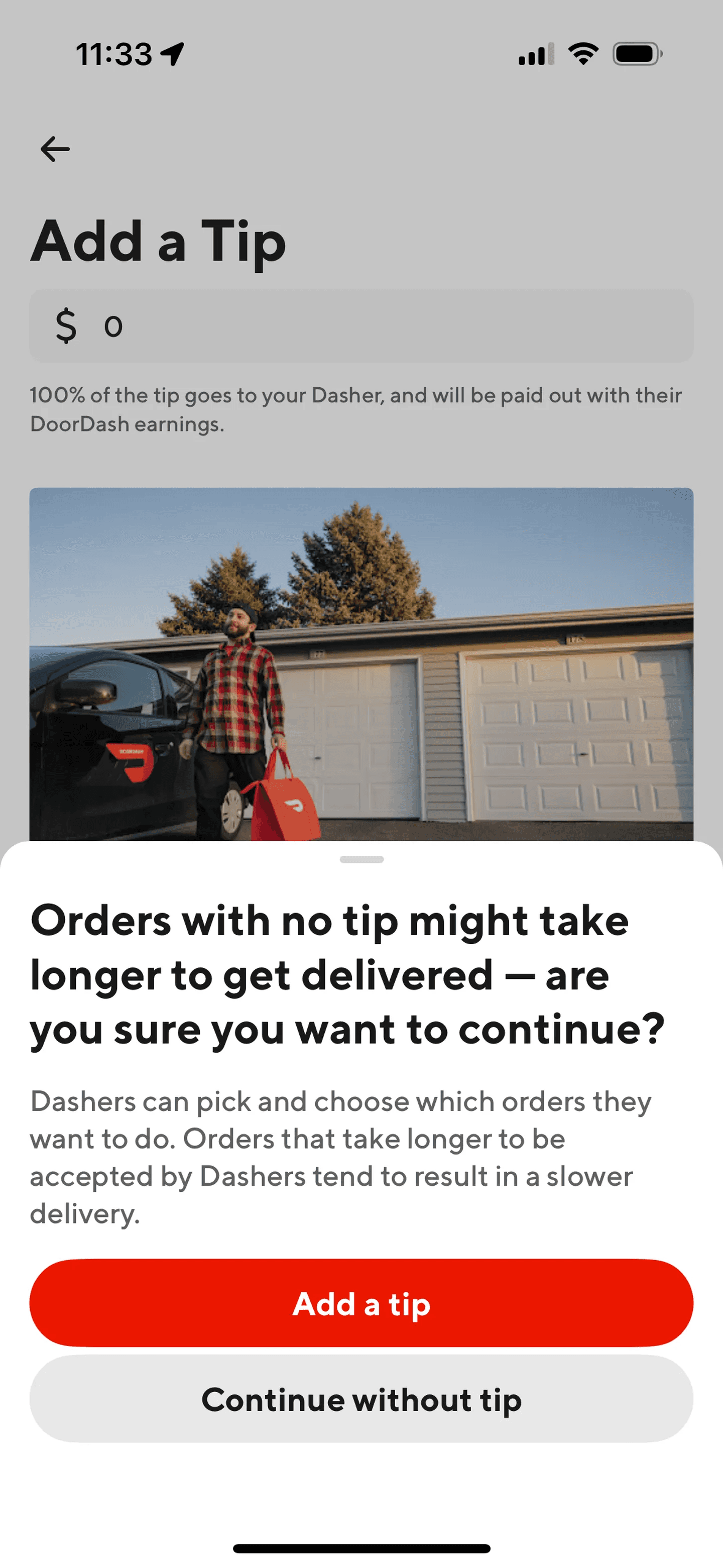
Example: "DoorDash now warns you that your food might get cold if you don't tip"
Uses guilt to manipulate behaviour
Creates artificial anxiety
Exploits immediate emotional responses
False Urgency 2.0 | Sleaze rating: 4/5
Creating artificial time pressure and scarcity to force quick decisions.
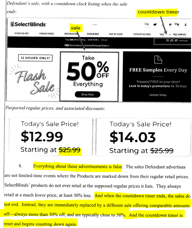
Example: "Select Blinds fined $10M for fake slashed prices, perpetual discounts and fake countdown timers"
Fake countdown timers
False scarcity messaging
Manipulated pricing displays
Subscription Trap | Sleaze rating: 5/5
Creating complex subscription models with hidden penalties and unclear terms.
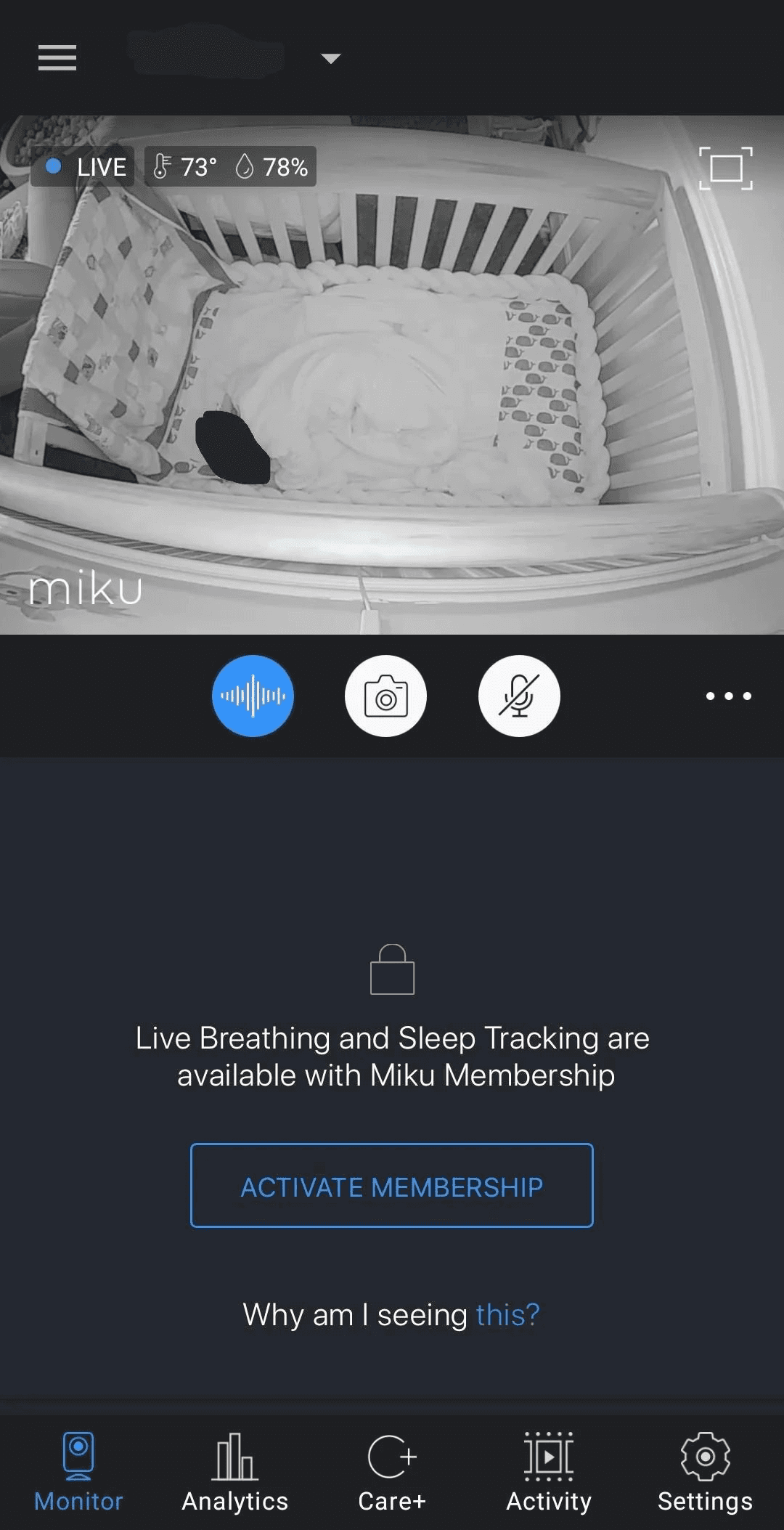
Example: "Miku Inc. tricks users into a monthly subscription"
$400 baby monitor locked previously free features behind monthly subscription
Basic functionality like push notifications for baby waking now costs $10/month
Users who bought hardware outright suddenly required to pay subscription for core features
No warning of feature removal during hardware purchase
Essential safety features moved behind paywall after purchase
Data Privacy Deception | Sleaze rating: 5/5
Misleading users about how their data is collected, used, or shared.
Example: "Google to pay $93m in settlement over deceptive location tracking"
Continued tracking after opt-out
Misleading privacy controls
Hidden data collection
Interface Interference | Sleaze rating: 4/5
Manipulating user interface elements to force specific behaviors.
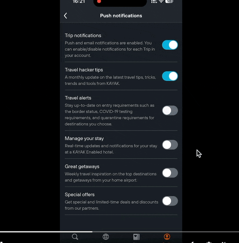
Example: "Kayak automatically re-enables push notification settings after user disables it"
Settings reset without consent
Persistent notification prompts
Override user preferences
Hidden Mandatory Account Creation | Sleaze rating: 4/5
Forcing users to create accounts for basic functionality that shouldn't require one.
Example Title: "HP printers should have EPEAT ecolabels revoked, trade group demands"
Required account creation to use basic scanner functionality
Forces users to provide personal information for offline features
Makes basic hardware features contingent on online accounts
Cancellation Complexity | Sleaze rating: 5/5
Making service cancellation unnecessarily complex and time-consuming.
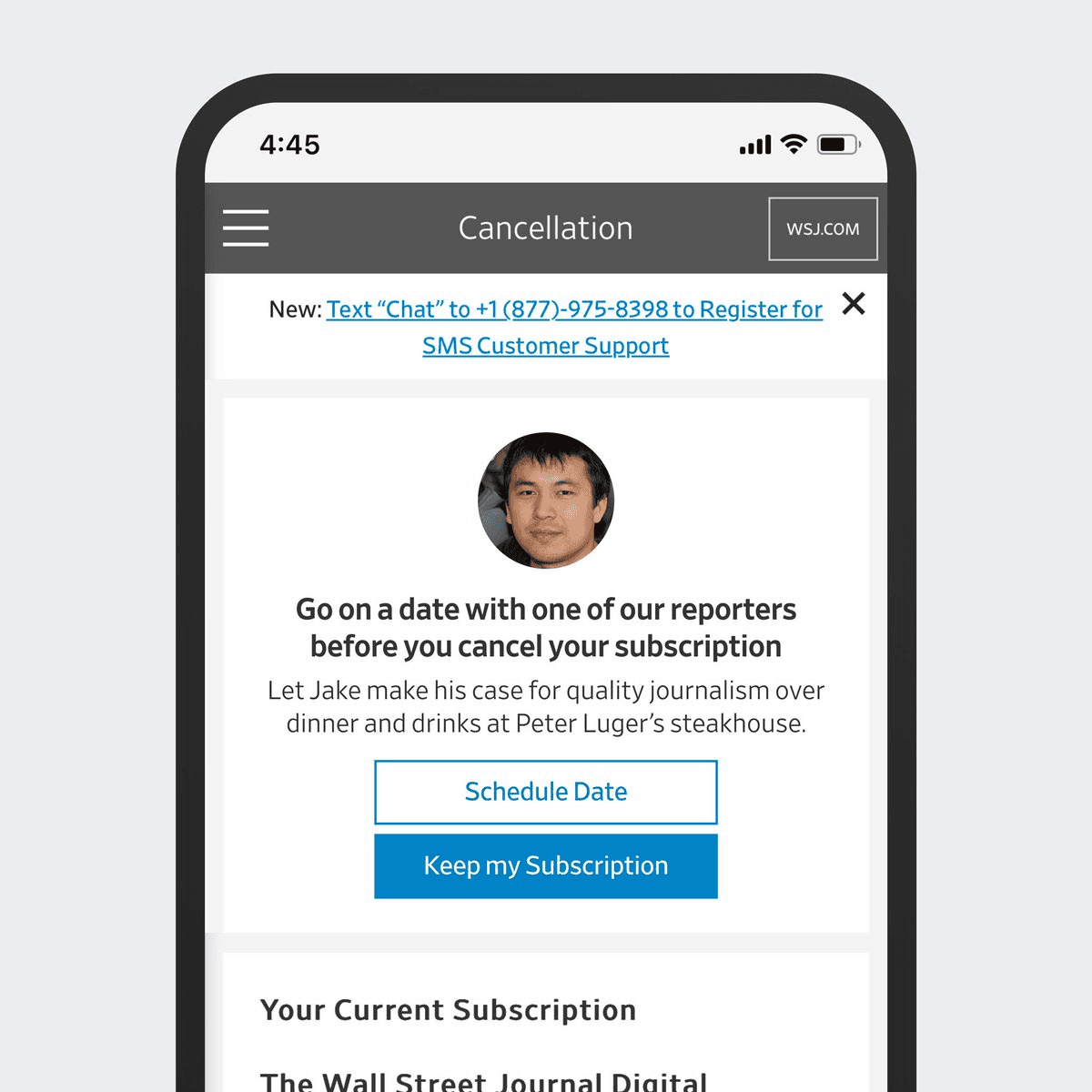
Example: "Go on a date with a reporter to cancel your Wall Street Journal subscription"
Required phone calls for cancellation
Multiple confirmation steps
Hidden cancellation process
Price Comparison Manipulation | Sleaze rating: 4/5
Manipulating how prices and plans are displayed to influence purchasing decisions and obscure true costs.
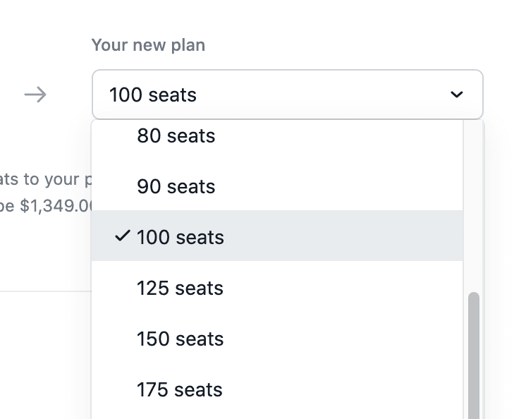
Example: "Asana uses per-seat pricing dark pattern to obscure total costs"
Pricing not clearly displayed upfront
Forces administrators to make individual seat decisions
Hides total cost until after significant user investment
Manipulates comparisons between pricing tiers
Makes it difficult to estimate actual organizational costs
Ethical Alternatives That Build Trust
Today's consumers value trust, honesty and transparency more than ever. They'll pay premium prices and become loyal to brands they believe understand and respect them.
Instead of Dark Patterns, Try These Approaches:
Clear and Transparent Information Provide straightforward details about the consequences of user actions.
Progressive Disclosure Gradually reveal information to prevent overwhelming users with too many choices.
Provide Meaningful Options Offer genuinely useful choices rather than ones that only benefit the business.
Personalisation Tailor experiences to individual preferences, giving users more control.
Empowerment Through Customisation Allow users to customise their experience, creating ownership and control.
Encourage Informed Decisions Include educational content that helps users understand their choices.
User-Centred Defaults Set defaults that align with what most informed users would choose, with easy options to change them.
Use Social Proof Responsibly When showing how many others have taken actions, ensure the information is ethical and truthful.
Ethical A/B Testing Ensure test variations don't exploit cognitive biases.
Feedback and Confirmation Provide clear feedback after actions and opportunities to confirm choices before finalising them.
Key Takeaway
While dark patterns may boost short-term conversions, they ultimately damage brand reputation, customer loyalty, and can result in significant financial penalties. Building transparent, user-respecting experiences creates sustainable business growth through trust and authentic relationships with your customers.