
The ultimate guide to effective UX design reviews: discover how these evaluations identify high-impact improvements, save time, and reduce costs without breaking the bank.
Why Conduct a UX Design Review?
UX design reviews deliver tremendous value by:
Identifying critical UX flaws and strengths early in the development process
Uncovering accessibility concerns before they become costly problems
Saving valuable time during both design and development phases
Providing cost-effective insights compared to extensive user testing (though user testing remains invaluable when budgets allow)
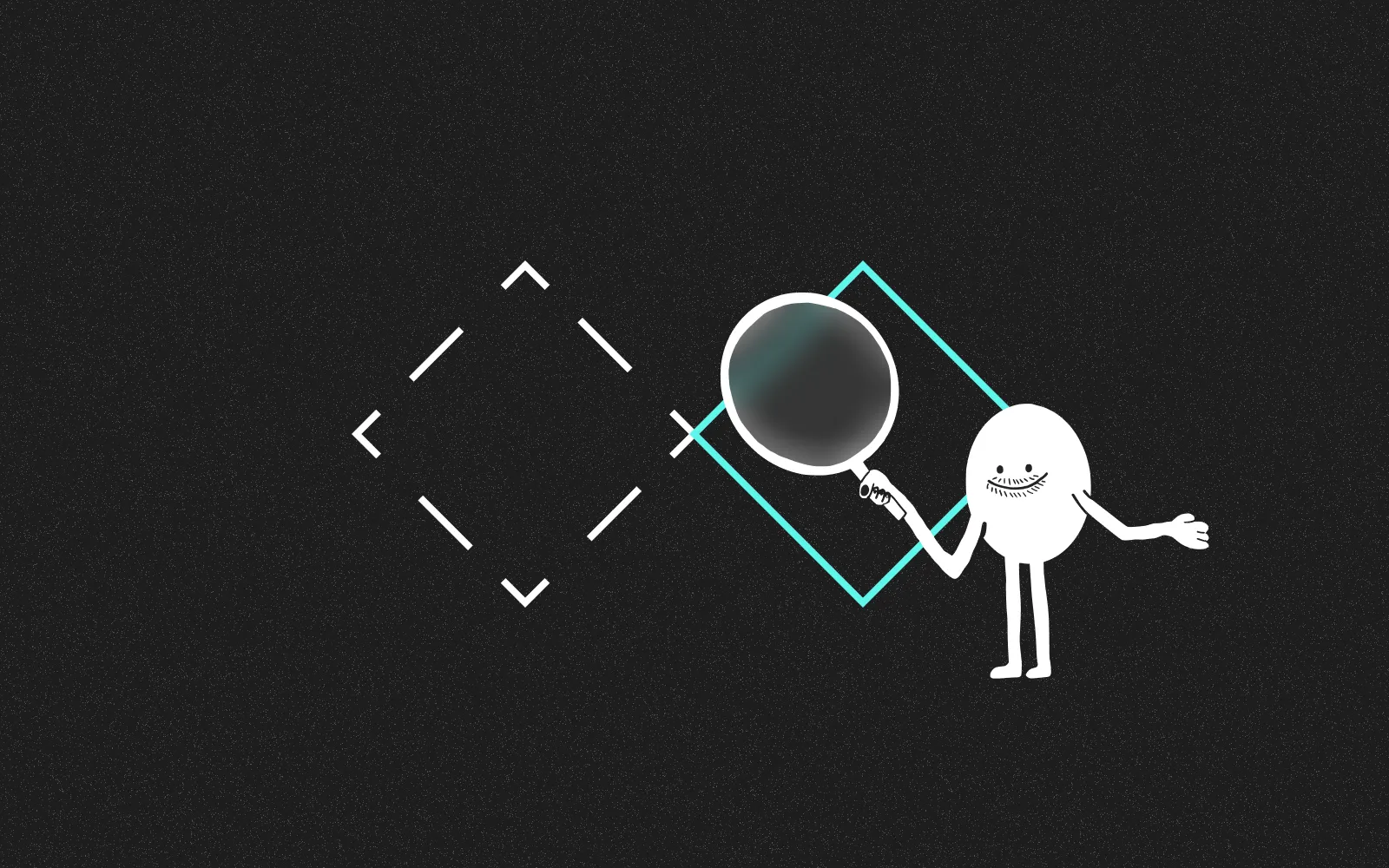
These reviews can be conducted at any stage of a product's lifecycle, provided the prototype has sufficient detail for evaluation.
Who should conduct a UX design review?
External evaluators often provide the most valuable perspective as they bring impartiality to the process. As Aurora Harley notes:
A fresh perspective is more likely to be unbiased and deliver candid feedback: an outsider is not emotionally invested in the design, is oblivious to any internal team politics, and can easily spot glaring issues that may stay hidden to someone who’s been staring at the same design for too long
Ideally your reviewer would possess:
Deep knowledge of UX best practices
Proficiency to assess the design using a set of usability guidelines, usability related psychology and human-computer interaction principles.User research experience
Having past experience conducting user research can be useful as they’ll know patterns of user behaviour to look out for.Domain knowledge
This is a bonus rather than a requirement, but having experience in the product sector can be useful.
I should stress, if you’re looking to build up experience get out there and start conducting your own UX design review. Don’t be put off by a checklist on a Medium article, start practicing!
The Power of Multiple Evaluators
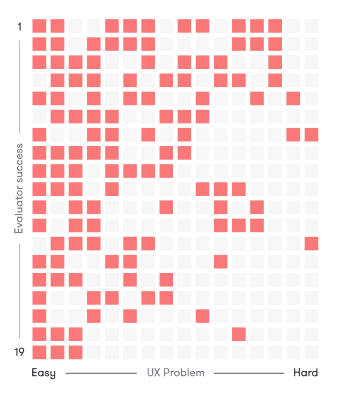
The NN Group wrote a fantastic piece on Heuristic Evaluations and found involving multiple evaluators improved the overall effectiveness in catching usability problems.
Below is a visualisation where 19 evaluators were tasked with finding 16 usability problems. While some of the more successful evaluators were able to identify more usability problems, some of the less successful evaluators were able to identify the harder problems.
Read the full study by the NN Group
So what does this show? In general, conducting a UX review is a challenging task for a single individual.
While it’s better than not conducting one at all, one person is unlikely to catch everything. This isn’t a reflection of their abilities; different evaluators excel in spotting different issues on different products — we’re all human, after all!
Based on the above study the NN Group recommends using between 3–5 evaluators, any more and you don’t gain much bang for your buck.
What benchmarks should I use in a UX review?
While design is subjective we use a set of standardised criteria to help identify potential UX pitfalls. Below is some of the criteria I’ve used previously, based on NN Group’s heuristic benchmarks:
System feedback
Is it clear to users what action they’ve taken and what they’ve achieved?Match system & real-world
Does the product use language and conventions familiar to users?Control & freedom
Can users recover easily from errors or wrong turns?Consistency & standards
Avoid guesswork. Users should not have to wonder whether different words, situations or actions mean the same thing.Error handling & prevention
Effective error messages and proactive design reduce mistakes.Recognition rather than recall
Minimise cognitive load by making objects, actions and information easily accessible.Flexibility and efficiency of use
Provide a smooth experience for both new and existing users.Aesthetics
Surface only relevant information. Key actions and dialogues should not compete with those of less importance.Accessibility & inclusion
Humans are diverse. Accommodating different abilities and perspectives gives everyone a sense of belonging.
Prioritisation: The Key to Actionable Results
Findings should be prioritised and a set of recommendations outlined on how to proceed next. This guides teams on where to allocate time, budget, and energy, and highlights quick wins!
We use a standard traffic light system, which Simon Jones’ article about delivering impact covers well:
Green: Positive
Reflects strong characteristics that appear to be working well and should be maintained in future phases.Amber: Caution
This rating has a detrimental affect on the experience and should be considered as soon as is practical.Red: Negative
This rating reflects aspects that will seriously harm the experience, and should be addressed at the earliest opportunity.
Getting Started: The Review Process
Before you begin, it’s essential to understand who will use the product and define specific tasks.
Talk to the project stakeholders to determine:
Core users
Common tasks
What information/guidance do the users need for each task
What should they already know (syntax etc)
Assuming we have the above, we now know the types of people using the product and their most common tasks. Imagine tasks as stories, divided into a beginning, middle, and end.
Real-World Example: Joe's UX Journey
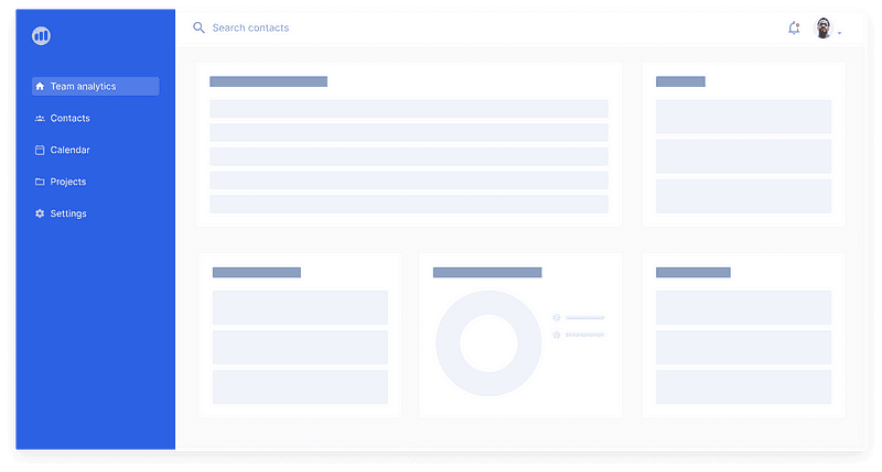
Let's examine how a UX review works in practice by following Joe from HR who needs to add a new employee to a CRM system:
Beginning: What does Joe need to know to start the task?
Joe's task begins when a new employee joins the company. He needs to add Jill to the new CRM system but isn't familiar with the interface yet.
Ok, a new employee has come on board. I need to add Jill to the new company CRM system.
Middle: How easy is it to get from beginning to end?
Joe needs to find where to add team members. He sees a 'Contacts' menu item and clicks on it, assuming this is where team information would be stored.
Huh, I can’t find where the Team is. There’s a ‘Contacts’ menu item so I’ll click on that first.
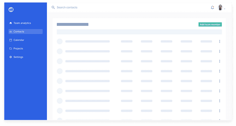
Ah, there they are!
I’ll click on the ‘Add team member’ button to add Jill to the system…
Joe continues on his journey until the end…
End: What does completion look like?
After completing the form, Joe receives a success message confirming Jill has been added to the system.
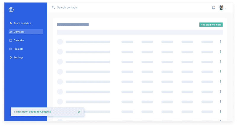
Great! A success message has appeared indicating Jill has been added to the system.
It’s a crude example but based on our earlier benchmark criteria we’d note the following:
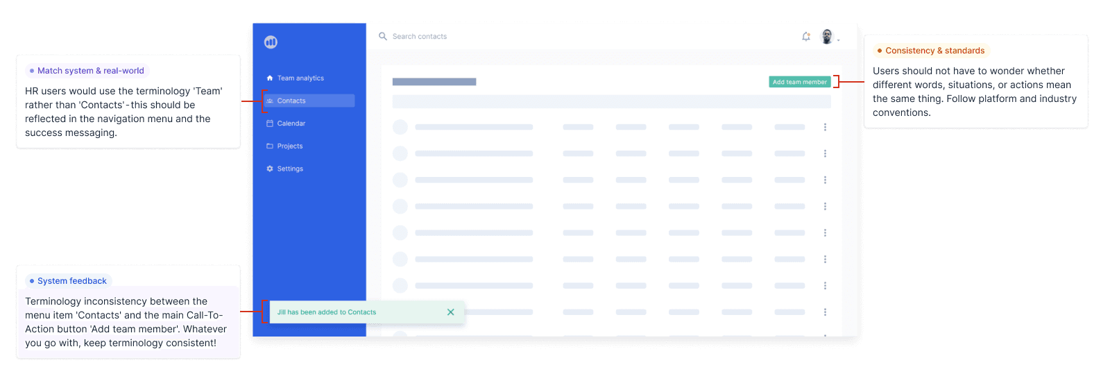
UX Review Findings from Joe's Journey
Our UX review reveals several issues using our traffic light system:
Red: Terminology mismatch - HR users would typically use 'Team' rather than 'Contacts' in their vocabulary. This creates confusion and should be addressed immediately.
Amber: Naming inconsistency - The menu item says 'Contacts' while the button says 'Add team member', creating inconsistent terminology that should be standardised.
Green: Effective feedback - The success message clearly confirms the action has been completed, a positive aspect that should be maintained throughout the application.
Small adjustments like these can greatly enhance the user experience.
Creating tasks based on core user needs helps identify potential issues systematically rather than stumbling upon usability problems by chance. You’ll likely find general usability issues as you go, so make sure to note those down as they emerge too.
Frequently Asked Questions About UX Design Reviews
Why should I conduct a UX design review?
UX design reviews identify usability flaws and strengths early in development, uncover accessibility concerns, save time during both design and development phases, and offer a cost-effective alternative to extensive user testing. The question isn't "Why conduct a review?" but rather "Why wouldn't you?"
Who should conduct a UX design review?
External evaluators are often the best choice as they bring an impartial perspective without emotional investment in the design. Ideal reviewers should have deep knowledge of UX best practices, user research experience, and potentially domain knowledge.
How many evaluators should participate in a UX review?
Research from the NN Group recommends using 3-5 evaluators. This number optimises identification of usability problems while remaining cost-effective. Their studies show that different evaluators catch different types of issues, making multiple perspectives invaluable.
What benchmarks should I use in a UX review?
Key benchmarks include system feedback, match between system and real world, user control and freedom, consistency and standards, error handling and prevention, recognition rather than recall, flexibility and efficiency of use, aesthetic design, and accessibility and inclusion.
At what stage of development should I conduct a UX review?
A UX design review can be performed at any stage of the product's lifecycle, provided the prototype has sufficient detail for evaluation. Earlier reviews often identify issues that are less costly to fix.
How should I prioritise UX findings?
Use a traffic light system: Green for positive aspects to maintain, Amber for issues that negatively impact experience and should be addressed soon, and Red for critical problems requiring immediate attention.
Key Takeaways
UX design reviews provide systematic, cost-effective insights that improve product usability. By mapping user journeys, applying standardised benchmarks, and prioritising findings, you can create a robust UX process that benefits both users and development teams alike.
When combined with user testing, these reviews ensure your product delivers the best possible experience with minimal wasted time and resources.